web3 crypto wallet

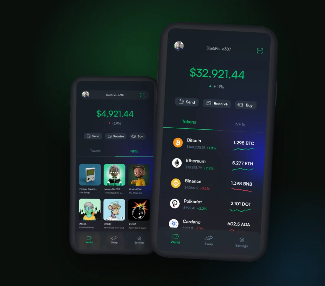
Wallet app on two phones: the token portfolio and the NFT gallery

my role

product & visual designer

project timeline

concept to high-fidelity ui | ios & android

team & stakeholders

founders | engineering


about this project

I designed a self-custody crypto wallet for a Web3 startup, working with the founders and their engineers on iOS and Android. Crypto wallets can be powerful and intimidating at the same time: addresses, gas, chains, and seed phrases up front, with the portfolio value buried and NFTs shown as a list of token IDs.

This case study covers how I built the wallet around what owners actually want to know, what it’s worth and what they own, and kept the complexity one layer down, there when you need it and out of the way when you don’t.

The problem

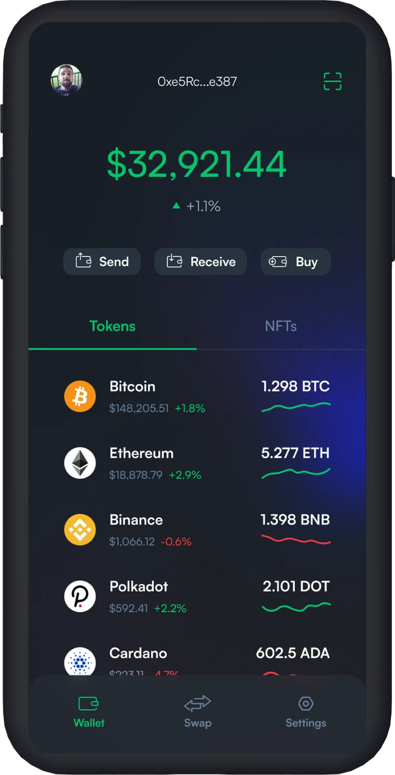
wallet portfolio with total balance, send, receive and buy, and a token list

problem 1

value is buried

Most wallets lead with addresses and network settings, not the one number people open the app for. Getting to a simple answer about your money takes digging.

I put a single total balance with its daily change at the top, and made send, receive, and buy the only three primary actions. People see what they have, and what changed today, at a glance.

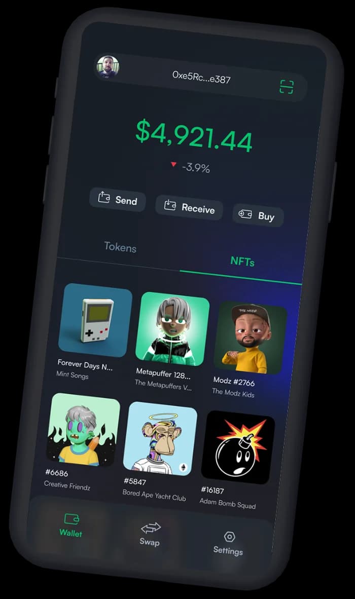
NFT gallery tab with collectible artwork in a grid

problem 2

nfts are second-class

Collectibles often show up as a list of IDs, disconnected from their artwork and their value, even though they’re the reason many people own a wallet in the first place.

I gave NFTs their own tab and gallery with the artwork front and center, under the same balance at the top. Collectors see their NFTs the way they think about them, as artwork.

“how do we make self-custody feel as calm as checking your bank balance?”

Business goals

Launch a wallet that feels trustworthy enough for people to hold real money in it.

Stand out from crypto-native wallets by being approachable for people who are newer to Web3.

Make buying crypto a primary action, right next to send and receive.

User goals

Know what everything is worth, and what changed today, without doing any math.

Send, receive, or buy in a couple of taps without decoding crypto jargon.

See NFTs as the artwork they are, alongside the rest of their portfolio.

let's make things happen

Reach out if you're looking for a product designer who can help you ship & scale user-friendly products.

Key design decisions

A few choices shaped the whole app. Each one trades a little flexibility for a lot of clarity.

lead with value

One total balance with its daily change sits at the top. It’s the number people open the app for, so it comes before addresses and network settings.

three actions, not twelve

Send, receive, and buy are the only primary actions. Fewer choices help a domain that feels risky feel calmer and safer.

nfts as equals

Collectibles get their own tab and gallery with the artwork front and center, instead of a list of token IDs.

results

3

primary actions: send, receive, and buy

2

tabs, with tokens and NFTs as equals

1

balance that answers “what’s it worth?”